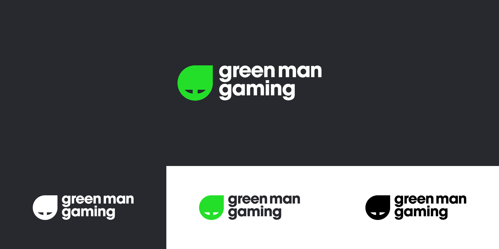
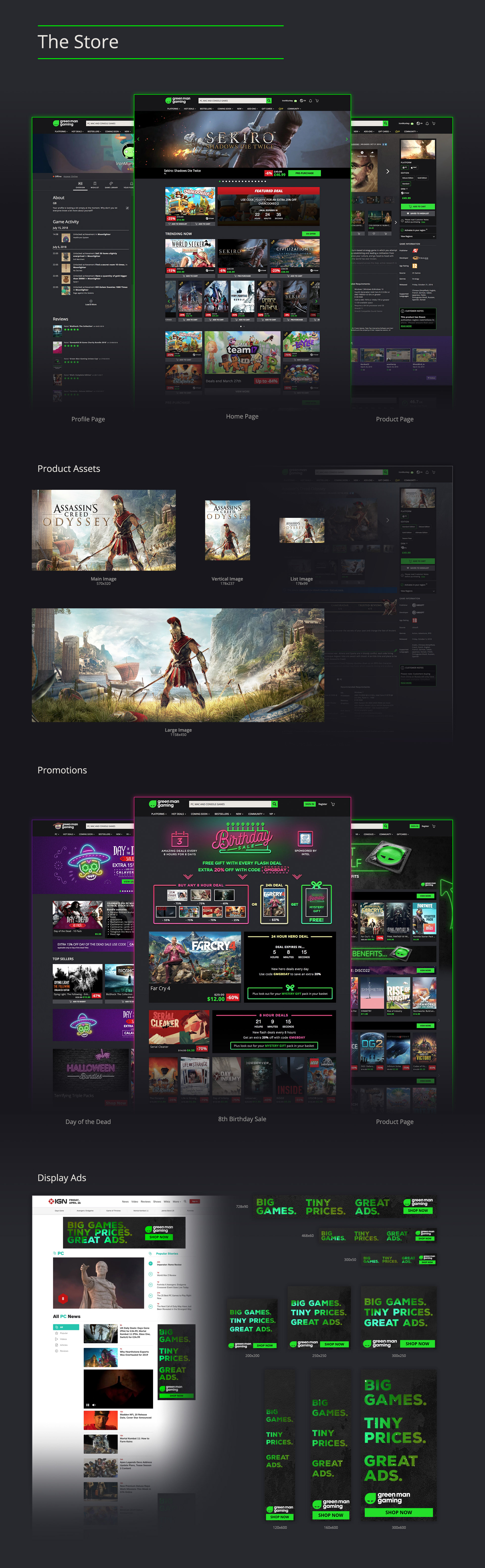
2/3 years my time at Green Man Gaming the company went through a major re-brand. The visual identity and site were updated to look modern & sleek and to be in line with our competitors. An agency created the foundation of the re-brand which encompassed the Logo, Site and Language, the design team implemented and turned the brand to what it is today. The Green Man Gaming brand had a clean minimalist approach but when it came to promotions we sometimes had to think outside the box as the marketing team sometimes thought the engagement needed to be more than the last promotion.
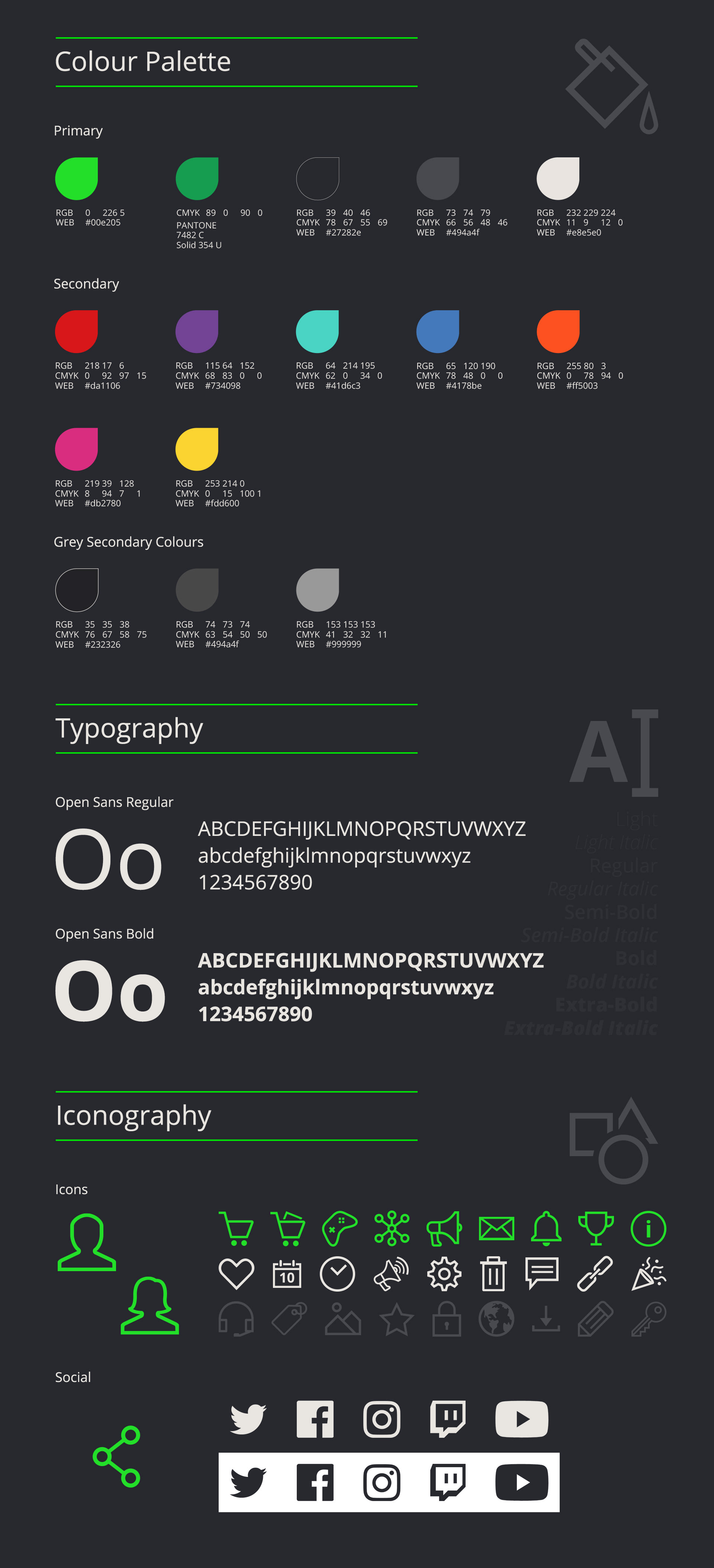
As the design manager, I liaised with various departments to shape and build the brand guidelines, coordinating with the design team with specific tasks that contributed towards the brand, overseeing and finalising the outcome. The crux of the brand consisted of creating and using guidelines, brand colour palette, typeface and an icon library. From this, we focused on stylising the brand on & off the site exploring ways to promote offers and events by Green Man Gaming.

For more UX/UI site features please look at my other projects.